Great email design isn’t about being fancy. It’s about choosing a layout that makes the next step obvious: click, reply, book, buy, register, or download.
In this guide, you’ll get 10 proven email layout recipes you can build fast using an email builder (text, image, button, divider, spacer, social buttons, countdown, forms, and mixed blocks). Each recipe includes: the block structure, best use case, and an example you can copy.
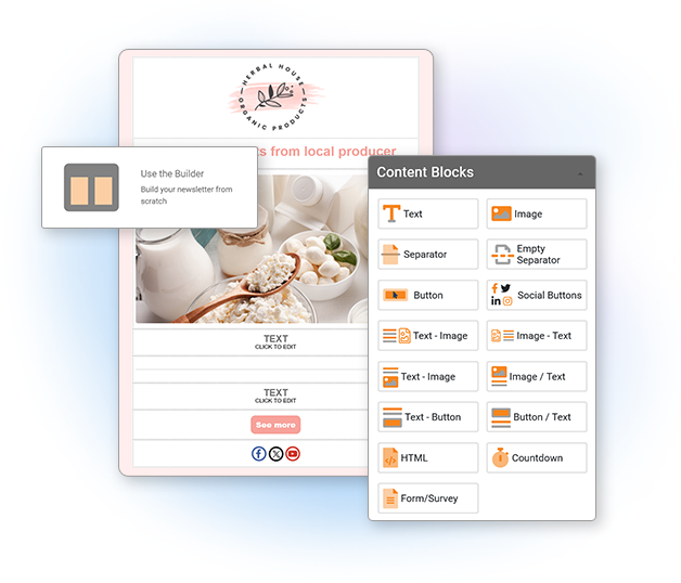
If you’re building in Mailpro, start here: Email Builder. If you want to move faster, pick a ready-made design: 500+ Email Templates.
How to use these recipes
Each recipe is written like a building plan. You’ll see:
- Block Structure (the order of blocks to stack)
- Best for (what type of email this layout wins at)
- Example (headline + short copy + CTA text you can adapt)
- Conversion tips (small tweaks that make a big difference)
If you prefer a faster start, open a template and replace the content: Mailpro Email Templates.
1) Hero + Single CTA (The “One-Goal Email”)
Best for: promotions, announcements, limited-time offers, a single product/service, “read this” content.
Block Structure
- Spacer
- Logo / brand header (Image)
- Headline (Text)
- Subheadline (Text)
- Hero Image (Image)
- Primary CTA (Button)
- Short supporting paragraph (Text)
- Divider
- Footer: address + unsubscribe + social (Text + Social Buttons)
Example
Headline: New: The faster way to create your next newsletter
Subheadline: Choose a layout, drop in your content, and send in minutes.
Button: Try the Email Builder
Support copy: Prefer starting from a ready-made design? Pick a template and customize it fast.
Conversion tips
- Only one primary button. If you add a second CTA, make it a text link below.
- Keep the first screen focused: headline + image + CTA should show quickly.
- Use specific CTA text (“Get the guide”, “Reserve my seat”) instead of generic (“Click here”).
If your button is not visually strong enough, use a dedicated CTA tool: Call-To-Action Buttons.
2) The Inverted Pyramid (For clicks without pressure)
Best for: content marketing, blog promotions, education emails, onboarding steps.
Block Structure
- Logo (Image)
- Headline (Text)
- Short intro (Text)
- Main image or visual (Image)
- Primary CTA (Button)
- Bullets: what they’ll learn / get (Text)
- Secondary CTA as a link (Text)
- Footer (Text + Social Buttons)
Example
Headline: 10 email layouts that make people click
Intro: If your emails look “fine” but don’t convert, the layout is often the missing piece.
Button: See the 10 recipes
Bullets: You’ll get layout blueprints for promos, events, product updates, surveys, and more.
Conversion tips
- Make the intro 2–3 lines max. The goal is to funnel attention down to the CTA.
- Add “what’s inside” bullets below the button to reduce hesitation.
3) Product Grid (2–3 items, clean and scannable)
Best for: ecommerce, “top picks”, new arrivals, bundles, upgrades.
Block Structure
- Header (Image/logo)
- Headline + short intro (Text)
- Item row 1: Image + Text + Button (use mixed blocks)
- Item row 2: Image + Text + Button
- Optional row 3 (only if needed)
- Divider
- Trust snippet: shipping / guarantee / support (Text)
- Footer (Text + Social Buttons)
Example
Headline: 3 customer favorites this week
Item structure: Product image → 1-line benefit → price or key detail → “Shop now”
Conversion tips
- Limit to 2–3 products if you want clicks. Too many choices lowers action.
- Keep each product description to 1 benefit line, not a paragraph.
- If you need more items, link to “view all” at the bottom.
4) Story → Proof → CTA (The trust-builder)
Best for: higher-priced offers, services, B2B, renewals, “why choose us” emails.
Block Structure
- Header (Image/logo)
- Headline (Text)
- Short story / context (Text)
- Proof block (Text): testimonial, stat, mini case study
- CTA (Button)
- FAQ mini section (Text)
- Footer (Text + Social Buttons)
Example
Headline: “We simplified our emails… and clicks went up.”
Story: The old layout had three competing buttons and a long intro. People didn’t know what to do.
Proof: After switching to one primary CTA and clearer sections, the email became easier to scan.
Button: See the layout
Conversion tips
- Proof works best when it’s specific (what changed, why it helped).
- Keep the CTA right after proof: that’s where motivation peaks.
5) Event / Webinar Layout (Agenda + speakers + register)
Best for: webinars, events, live demos, workshops, training sessions.
Block Structure
- Header (Image/logo)
- Event title + date/time (Text)
- Hero image (Image)
- Primary CTA (Button)
- Agenda (Text with short bullets)
- Speakers (Image-Text blocks)
- Reminder CTA (Button or Text link)
- Footer (Text + Social Buttons)
Example
Title: Live training: Email layouts that boost clicks
Date: Thursday, 2 PM (your time)
Button: Reserve my seat
Agenda bullets: 10-minute checklist • 3 layout swaps • Q&A
Conversion tips
- Put the registration button above the agenda. People decide early.
- Repeat the CTA after the speaker section for skimmers.
Like these layouts? Mailpro’s plans include a drag-and-drop block editor — assemble any of these recipes in minutes, no code.
6) “Feature Drop” Layout (Release notes people actually read)
Best for: product updates, SaaS announcements, “what’s new” newsletters.
Block Structure
- Header (Image/logo)
- Headline (Text)
- Short “why it matters” intro (Text)
- Feature 1: Image + Text + link (Image-Text block)
- Feature 2: Image + Text + link
- Feature 3: Image + Text + link
- Primary CTA (Button)
- Footer (Text + Social Buttons)
Example
Headline: New this month: faster building, cleaner layouts
Intro: Three upgrades that make your next campaign easier to create and faster to read.
CTA: Explore the updates
Conversion tips
- For each feature: use 1 line benefit + 1 line “how it helps”.
- Link each feature title to a relevant page, then keep one primary “try it” button at the end.
7) Flash Sale + Countdown (Urgency without chaos)
Best for: flash sales, limited-time offers, cart recovery offers, seasonal promos.
Block Structure
- Header (Image/logo)
- Headline (Text)
- Countdown Timer block
- Hero Image (Image)
- Offer details (Text)
- CTA (Button)
- Fine print (Text)
- Footer (Text + Social Buttons)
Example
Headline: 24-hour offer: Save 20% today
Offer details: Use code SAVE20 • Ends tonight
Button: Claim my discount
Conversion tips
- Keep urgency clean: countdown + one offer + one CTA.
- Put the countdown near the top so it’s seen early.
If you want to add urgency the right way, use: Countdown Timer.
8) Appointment / Booking Layout (Simple, service-based)
Best for: salons, clinics, consultants, local services, confirmations + rebooking.
Block Structure
- Header (Image/logo)
- Headline (Text)
- 3 quick benefits (Text bullets)
- CTA (Button)
- Optional: Image (team / location / service)
- Secondary CTA (Text link)
- Footer with contact info (Text)
Example
Headline: Ready for your next appointment?
Bullets: Fast booking • Flexible times • Friendly support
Button: Book a time
Conversion tips
- Make the CTA about the action (“Book”) not the business (“Learn more”).
- Keep benefits short; you’re reducing friction, not explaining everything.
9) Lead Magnet Layout (Download + follow-up path)
Best for: guides, checklists, ebooks, templates, toolkits, free trials.
Block Structure
- Header (Image/logo)
- Headline (Text)
- What you’ll get (Text bullets)
- Hero image (cover mockup) (Image)
- CTA (Button)
- “What happens next” (Text)
- Footer (Text + Social Buttons)
Example
Headline: Free checklist: 25 email QA checks before you send
Bullets: Layout checks • Link checks • Mobile checks • Deliverability basics
Button: Download the checklist
Next: After downloading, you’ll receive 2 short emails with examples you can copy.
Conversion tips
- Make the lead magnet feel “small and immediate” (checklists convert well).
- Explain “what happens next” to reduce anxiety and spam complaints.
10) Survey / Form Layout (Low friction feedback email)
Best for: feedback surveys, onboarding questions, post-purchase feedback, quick registrations.
Block Structure
- Header (Image/logo)
- Headline (Text)
- One-sentence reason (Text)
- Embedded Form block OR Button to form (Form or Button)
- Trust line (Text): “Takes 30 seconds” / “No login”
- Optional: incentive (Text)
- Footer (Text)
Example
Headline: Quick question (30 seconds)
Reason: Your answer helps us improve the next update.
Button: Answer the 3 questions
Trust line: No login. One minute. That’s it.
Conversion tips
- Ask for the minimum (3–5 questions). You can always follow up later.
- Say the time it takes. “30 seconds” is often the best conversion lever.
If you want to build and share a form quickly, start here: Form Builder and Share Forms.
How to make layouts convert (without redesigning everything)
1) One email = one primary action
You can include supporting links, but always choose one main action. When everything is important, nothing gets clicked.
2) Put the CTA where the decision happens
For promos/events: CTA early. For trust-heavy offers: CTA after proof. For long emails: repeat the CTA once.
3) Design for skimmers
Most readers skim: headline, image, bold phrases, button. Use short paragraphs, clear headings, and dividers/spacers.
4) Keep blocks consistent
The email feels “easier” when repeated elements look the same (same button style, same spacing, same product block format).
5) Send the right layout to the right people
A beautiful layout won’t convert if it reaches the wrong audience. Use targeting to avoid “one-size-fits-all” campaigns: Email Segmentation and Tags.
How to measure what’s working
“Converting” can mean different things: clicks, purchases, bookings, replies, downloads. Start by tracking two essentials:
- Overall campaign performance (trendline over time, what’s improving, what’s dropping)
- Click behavior (which sections and buttons get attention)
Mailpro gives you both: Campaign Performance and Click Analysis.
Practical rule: if your clicks are low, simplify the layout (Recipe #1 or #2). If clicks exist but conversions are low, improve the landing page match and tighten the offer.
How to choose the best recipe in 30 seconds
- One offer / one link? Use Recipe #1 (Hero + Single CTA).
- Blog or education? Use Recipe #2 (Inverted Pyramid).
- Multiple products? Use Recipe #3 (Product Grid).
- High trust needed? Use Recipe #4 (Story → Proof → CTA).
- Event? Use Recipe #5 (Event Layout).
- Product updates? Use Recipe #6 (Feature Drop).
- Urgency? Use Recipe #7 (Countdown).
- Service booking? Use Recipe #8 (Appointment).
- Free download? Use Recipe #9 (Lead Magnet).
- Feedback or sign-up? Use Recipe #10 (Survey/Form).
Build these layouts in Mailpro
Want to create these layouts quickly without touching code? Use the Mailpro Email Builder to drag-and-drop blocks (text, images, buttons, dividers, spacers, social buttons, countdown, forms, and more).
Or start with a ready-to-use design and swap your content: Browse Mailpro’s Email Templates.
Mailpro and email layouts that convert
Build high-converting layouts with drag-and-drop blocks
Proven layouts only work if you can build them fast. Mailpro’s block-based, drag-and-drop editor lets you assemble these recipes in minutes — no code, on any plan.
