Newsletters that look perfect on every screen.
Around 80% of people read email on a phone or tablet. Mailpro's builder makes every newsletter fully responsive — automatically adapting layout, tables and images to any device, with no design or coding skills required.
Why responsive design matters
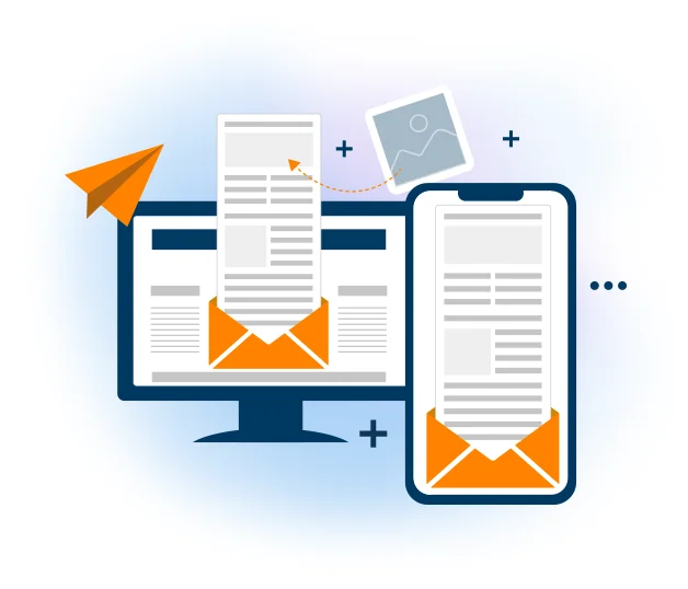
With most emails now opened on mobile, a design that doesn't adapt loses readers instantly. With the Mailpro newsletter builder, you design your message once and it's automatically optimized for small screens — so it reaches every subscriber looking its best, whatever device they use.
Being able to view content correctly on any device also lowers your bounce rate. Without any design or programming knowledge, the fully responsive builder adapts your content, tables and images for mobile, and the preview tool lets you check exactly how it looks before you send.
Responsive, without the effort
Design in the drag-and-drop editor or start from a template. When creating mobile-first emails, keep visuals accessible too — read our tips on inclusive email marketing.
Frequently asked questions
What is a responsive newsletter?
Do I need design or coding skills?
Why does responsiveness matter?
Reach every subscriber, on any device
Start free and create responsive newsletters that look perfect on mobile, tablet and desktop — automatically.