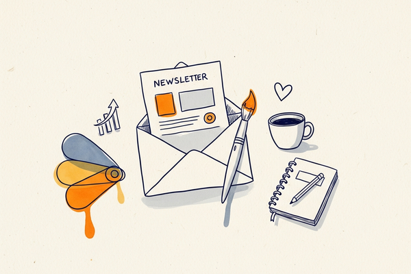
When someone opens your email, they do not begin by carefully reading every word. First, they react to what they see. The colors in your newsletter create an immediate feeling. They can make your brand seem trustworthy, energetic, elegant, calm, modern, or urgent in just a few seconds. That is why color is not just decoration. In email marketing, color is part of the message.
For many businesses, choosing a newsletter color palette feels like a small visual detail. In reality, it can affect how subscribers perceive your brand, how easily they understand your content, and whether they click on your call to action. Good color choices help guide the eye, build trust, and support conversions. Poor choices can make an email feel confusing, outdated, or hard to read.
If you want your newsletters to look more professional and perform better, color should be part of a bigger visual strategy. That is why this topic works so well alongside our article on email design and how it helps highlight your brand. A strong email design does not depend only on layout or images. It also depends on using the right colors to create the right emotional response and make your message easier to act on.
Why color matters in email marketing
In email marketing, first impressions happen fast. Most subscribers do not read every line from top to bottom. They scan. They look at the subject line, the header, the image, the structure, and the button. In just a few seconds, they decide whether the email feels relevant, trustworthy, and worth their time.
Color plays an important role in that decision. It helps direct attention, create visual hierarchy, and support the mood of the message. A balanced palette can make an email feel polished and professional. A chaotic palette with too many strong colors can make it feel disorganized and harder to trust.
Color also helps with recognition. When your newsletters consistently use the same main colors as your website, logo, and brand materials, subscribers begin to identify your emails more quickly. That consistency matters. It helps your communication feel familiar, and familiarity often supports trust.
When combined with a good structure, the right palette can make your email easier to scan and more pleasant to read. If you are building campaigns from scratch, it also helps to use a tool that lets you control those visual details easily, such as a newsletter builder with drag-and-drop and HTML editing options.
What is color psychology?
Color psychology is the idea that colors influence perception and emotional response. In marketing, it is used to shape how a brand feels and how a message is received. Some colors are often associated with trust, others with urgency, others with creativity or luxury.
Of course, color psychology is not an exact rulebook. Reactions to color can vary depending on culture, industry, age, and context. Still, common patterns appear often enough that they can be useful when designing a newsletter. Instead of choosing colors randomly, you choose them with a purpose.
In practical terms, color psychology in email marketing helps answer questions like these: Should this email feel reassuring or exciting? Should this button stand out more? Should the overall design feel premium, playful, or highly professional? Once you begin to think of color in those terms, your email design becomes more strategic.
How colors affect subscriber behavior
Subscribers react to visual cues before they fully process your copy. If your email looks clean, coherent, and easy to understand, they are more likely to keep reading. If your design feels noisy or visually stressful, they may ignore it or leave it quickly.
Color affects where the eye goes first. It influences what feels important. It can draw attention to your main offer, make your call to action more noticeable, and help separate one section from another. Even something as simple as changing a button from a muted color to a more visible accent can affect how obvious the next step feels.
This is why the best-performing newsletters do not use color everywhere in the same way. They use it selectively. The goal is not to make every part of the email loud. The goal is to make the right part stand out.
Common color meanings in email marketing
Below are some of the most common emotional associations marketers consider when selecting colors for newsletters. These are not strict rules, but they can help guide your decisions.
Blue: trust, stability, professionalism
Blue is one of the most common colors in professional branding. It often feels safe, calm, and dependable. It is popular in industries such as finance, software, healthcare, consulting, and education because it helps communicate trust.
Blue works well in headers, icons, links, and buttons when your goal is to reassure readers and create a reliable impression.
Green: growth, wellness, balance
Green is often associated with health, freshness, nature, progress, and financial success. It can be a strong choice for wellness brands, educational organizations, eco-friendly businesses, and many lifestyle brands.
Green often works well in campaigns that focus on improvement, positive change, or well-being.
Red: urgency, excitement, action
Red attracts attention very quickly. It is often used in limited-time offers, promotional campaigns, and sale emails because it creates urgency and energy. A red banner or button can be powerful when used with moderation.
Too much red, however, can make a design feel aggressive or overwhelming. It is usually more effective as an accent than as the dominant color of the entire email.
Orange: enthusiasm, friendliness, movement
Orange often feels lively and approachable. It combines the energy of red with a warmer, friendlier tone. It can work especially well for calls to action, event promotions, and campaigns that need to feel positive and active.
If you want a CTA button to stand out without looking too aggressive, orange can be an excellent option.
Yellow: optimism, warmth, visibility
Yellow can feel bright, cheerful, and energetic. It is often used in small highlights or seasonal designs. However, it needs to be handled carefully because very light shades can reduce readability.
Yellow is usually best used as a supporting accent rather than a dominant background color.
Black: luxury, sophistication, authority
Black can create a premium and elegant feeling. It is often used by luxury, beauty, fashion, and high-end technology brands. Combined with whitespace and restrained design, black can make a newsletter feel bold and refined.
White and neutral tones: clarity, simplicity, cleanliness
Neutral backgrounds such as white, soft gray, beige, or light tones are extremely useful in email marketing. They improve readability, reduce visual clutter, and help stronger accent colors stand out more effectively. In many cases, a clean neutral base is what makes a conversion-focused design work.
This is also one reason why minimal design often performs well. If you want to explore that angle more, see our article on minimalist email design.
How to choose the right color palette for your brand
Choosing the right palette does not mean using many colors. In fact, simpler palettes often perform better because they create more consistency and less confusion. Here is a practical way to build a strong newsletter color palette.
1. Start with your brand personality
Ask yourself how your brand should feel. Should it feel trustworthy and serious? Warm and personal? Bold and energetic? Elegant and premium? Your colors should reinforce that identity.
If your brand voice is calm and reassuring, extremely aggressive colors may feel out of place. If your brand is youthful and dynamic, dull or overly corporate colors may weaken the emotional connection.
2. Use your primary brand color consistently
Your main brand color should appear regularly across your email marketing. This helps subscribers recognize your content more easily and creates continuity between your emails and your website.
Consistency does not mean repetition without thought. It means using your brand color in a stable way so your audience feels they are interacting with the same visual identity every time.
Got your palette? Mailpro’s plans include a drag-and-drop editor and brandable templates — apply your colors across every email, no designer needed.
3. Add one or two supporting colors
Supporting colors can help give structure to your newsletter without making it feel overloaded. You might use them for content blocks, dividers, icons, or secondary calls to action.
Try not to add too many strong colors. One main brand color, one accent color, and one or two neutrals is often enough for a very good result.
4. Choose a clear action color for your main button
Your main CTA button should be visually obvious. That means it needs contrast. It should stand out clearly from the surrounding area while still fitting with your brand style.
If you use Mailpro’s CTA button features, this is easier to manage because you can create buttons that support the action you want readers to take while keeping the overall design consistent.
How to use color in newsletter buttons
Buttons are one of the most important places to apply color psychology in email marketing. Even when subscribers only skim the content, they often notice the button. A strong button color tells them where to click and what action matters most.
To improve button performance, keep these best practices in mind:
- Make sure the button color contrasts clearly with the background.
- Use text that is easy to read.
- Leave enough white space around the button.
- Use the same color for the main CTA throughout the email.
- Avoid using too many competing button colors.
If every button looks different, the visual hierarchy becomes weaker. A subscriber should be able to instantly understand what the main action is.
How to use color in headers and content sections
Your header is one of the first things people see, so it sets the emotional tone of the email. A strong header color can reinforce your brand immediately. It can also make your newsletter feel more polished and recognizable.
Color can also help organize the body of the email. For example, lightly tinted content sections can separate ideas without overwhelming the design. Accent colors can be used to highlight an important tip, a discount, or a testimonial. The goal is not to use color everywhere, but to use it where it improves clarity.
When thinking about sections, remember that the entire newsletter experience matters, including the closing area. A well-designed footer supports professionalism and consistency too. For related guidance, see our article on effective email footer design.
The importance of contrast and readability
One of the biggest mistakes in email design is choosing colors based only on emotion and ignoring readability. A beautiful palette will not help if the text is too faint to read or if the button does not stand out enough to attract clicks.
Contrast affects accessibility, usability, and conversion. If your subscribers struggle to read the message, they are less likely to continue. If the CTA blends into the rest of the design, they may not act. This is especially important on mobile devices, where limited screen size makes visual clarity even more important.
That is why responsive design matters. Your email should not only look good on desktop. It should also remain clear and readable on phones and tablets. If you want to learn more about that, see our page on responsive newsletters and our glossary entry on responsive email.
How different industries may use color differently
There is no universal best color for newsletters. The right palette depends on your brand, your audience, and your industry.
Retail and e-commerce
Retail brands often use stronger accent colors for calls to action and promotions. They may use warmer colors for seasonal sales or brighter button colors to support faster action.
B2B and software
B2B businesses often rely on blues, dark neutrals, and clean layouts because they want to project trust, expertise, and clarity.
Luxury and beauty
Luxury brands often use restrained color palettes with black, white, beige, or muted tones. The goal is to create elegance and confidence rather than visual noise.
Health and wellness
Soft greens, calming blues, and light neutrals are common because they suggest balance, health, and reassurance.
Family, food, and lifestyle brands
Warmer tones such as orange, yellow, soft red, or earthy colors can help create a more friendly and welcoming mood.
Common mistakes to avoid
Using too many colors
Too many strong colors make a design feel scattered. This can reduce clarity and make the brand look less professional.
Following trends instead of your brand identity
A trendy palette may look attractive, but if it does not match your brand, the email may feel inconsistent with the rest of your communication.
Ignoring mobile design
Many subscribers open newsletters on mobile devices. A subtle CTA or weak contrast can become even less effective on a smaller screen.
Using low-contrast text
Light text on light backgrounds may look elegant at first, but it often hurts readability and performance.
Making every section loud
If everything demands attention, nothing stands out. Good email design needs focal points and calm areas.
Should you test different color choices?
Yes, but testing works best when the rest of your email is already solid. If your message, offer, and structure are weak, changing one button color will not solve the larger problem. But once the fundamentals are in place, testing color can help improve performance.
You might test:
- One CTA color against another
- A light header versus a dark header
- A minimal palette versus a more promotional palette
- A softer button style versus a stronger contrast button
These tests can help you understand what feels most natural and effective for your specific audience.
A simple color framework for non-designers
If you are not a designer, the best approach is often the simplest one. Use this framework:
- Choose one main brand color.
- Use one or two neutral tones for balance.
- Select one accent color for your primary CTA.
- Keep text easy to read.
- Use the palette consistently across campaigns.
This helps your newsletters look cleaner, more intentional, and easier to trust. It also makes it easier to work with ready-made layouts if you prefer starting from a template rather than a blank page. Mailpro offers professional email templates that you can adapt to your own brand colors and style.
How Mailpro can help you apply color psychology in your campaigns
Understanding color psychology is useful, but the real value comes from applying it consistently in your newsletters. With Mailpro, you can build campaigns that keep your brand colors aligned across headers, buttons, content blocks, and layout sections. This makes your emails look more professional and more coherent.
Whether you want to create a minimalist branded newsletter, a stronger promotional email, or a more conversion-focused design, having control over color, structure, and responsive behavior makes the process easier. That is especially helpful when you want to create newsletters regularly without losing visual consistency.
If you are looking for a practical way to combine branding, readability, and conversion-focused design, start with a strong structure, choose a smart color palette, and connect it all back to your overall email design strategy.
Final thoughts
Color does much more than make a newsletter look attractive. It helps shape emotion, highlight what matters, build trust, and guide action. The right palette can make your emails feel clearer, more polished, and more persuasive.
You do not need a complicated system to make color psychology work in email marketing. You need consistency, contrast, and colors that reflect your brand personality and support the action you want readers to take.
When used with purpose, color becomes more than visual decoration. It becomes part of your conversion strategy.
And because color is only one part of a strong visual identity, be sure to also explore our full guide on email design and how it helps your brand stand out.
Mailpro and email design
Pick the palette — then build it without a designer
Color sets the mood before a word is read. Mailpro’s drag-and-drop editor and brandable templates let you apply your palette across every email — no design software, no extra cost.