Email marketing is all about connection — but if your emails aren’t accessible, you might be unintentionally excluding a big part of your audience.
Millions of people live with neurodiverse conditions like dyslexia and ADHD, and they experience digital content differently. Designing emails that are easier for them to read, understand, and act on isn’t just a nice-to-have — it’s a best practice for inclusive email marketing. And with tools like Mailpro, it’s easier than ever to create accessible emails without needing technical expertise.
In this article, we’ll show you how to create accessible emails that support neurodivergent readers — with practical design tips, tone suggestions, and layout ideas.
🧠 Why This Matters: Understanding Neurodivergent Email Readers
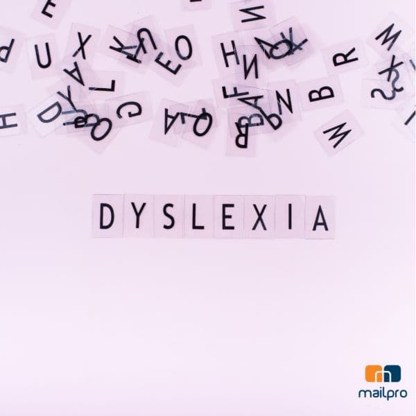
Dyslexia:
People with dyslexia may struggle with:
- Reading long paragraphs
- Processing fonts that are overly stylized
- Skimming through cluttered layouts
- Differentiating certain letter combinations
ADHD:
People with ADHD often find it difficult to:
- Focus on large blocks of text
- Navigate disorganized content
- Find clear calls to action
- Avoid sensory overload from busy visuals
When your emails don’t account for these challenges, you risk confusing or overwhelming a significant segment of your audience — even if your message is relevant.
✉️ Email Design Tips for Dyslexia and ADHD
1. Choose Readable Fonts
Use clean, simple fonts like:
- Arial
- Verdana
- Tahoma
- Open Sans
Avoid:
- Script fonts
- Cursive styles
- Overly thin or decorative typefaces
Stick to left-aligned text — justified or centered blocks can be harder to follow. And aim for a minimum of 14px font size for body text and 18–22px for headers.
💡 With Mailpro’s email builder, you can easily select accessible font styles and adjust sizes visually — no need to write a line of code.
2. Break Up the Content Visually
Walls of text are overwhelming — especially for readers with dyslexia or ADHD, who may struggle to stay focused or track lines of text.
To make your emails easier to read, structure your content into small, manageable chunks. This not only improves comprehension but also encourages more engagement.
Use:
- Clear headings and subheadings to guide the reader through the message
- Bulleted or numbered lists to simplify ideas and actions
- Short paragraphs of no more than 2–4 lines to avoid visual fatigue
- Plenty of white space to give the eye room to rest and reset
Even for readers without neurodiverse traits, a well-organized email just feels better. And with Mailpro’s intuitive drag-and-drop editor, you can quickly build clean, well-spaced layouts that are easy to scan and navigate — no design skills required.
3. Use Clear, Descriptive Headings
Headings aren’t just a visual break — they’re mental anchors that help guide your readers through your message. This is especially important for people with ADHD or dyslexia, who benefit from structure, clarity, and the ability to quickly understand what each section is about.
Vague or generic headings don’t help the reader know where to focus or what to expect. They might skip over something important just because the title wasn’t compelling or clear.
Instead of something like:
“Our Latest News”
Go for:
“3 New Features You’ll Love in This Month’s Update”
or
“How to Automate Your Email Campaigns in Under 5 Minutes”
These kinds of headings communicate value instantly, helping readers decide what’s worth their attention.
💡 With Mailpro’s template system, you can easily insert properly formatted headings that visually break up your content — so you can focus on clarity and message flow, without fiddling with the formatting.
4. Minimize Distractions
People with ADHD or dyslexia can become easily overwhelmed by overly busy emails. Too much visual noise can make it hard to focus, absorb information, or even know where to start reading.
To keep your emails distraction-free and reader-friendly, avoid elements that compete for attention, such as:
- Auto-playing GIFs or videos
- Flashy or fast-moving animations
- Scrolling text or banner ads
- Background images behind text (which can reduce readability)
If you do include visuals or animations, use them with purpose — and make sure they loop subtly or stop after a few seconds. Every design element should enhance your message, not distract from it.
✨ Remember: less is more. A simple, clean layout improves focus for all readers, and especially for those with attention challenges. With Mailpro, you get full control over your design — allowing you to customize layouts without adding unnecessary clutter.
5. Make CTAs Easy to Spot and Simple to Understand
For readers with ADHD, clarity and direction are essential. They’re more likely to engage when your email tells them exactly what to do — without making them search for it.
That’s why your call to action (CTA) should be unmistakable, immediate, and focused. A good CTA doesn’t just sit there — it stands out and guides your reader toward the next step.
Here’s how to make it work:
- Use large, mobile-friendly buttons that are easy to tap
- Write action-oriented text, like “Download the Guide,” “Claim Your Offer,” or “See the Product”
- Ensure high contrast so the button pops off the page and draws attention
- Limit competing links or distractions — stick to one main CTA per email whenever possible
✨ A strong CTA gives your email purpose. Without it, your reader may engage with the content… and then do nothing.
With Mailpro’s email templates, you get customizable CTA blocks that are designed for both readability and conversion — helping you guide every reader, including those with attention challenges, straight to action.
6. Use Color and Contrast Wisely
Color plays a powerful role in how your emails are experienced — and for people with dyslexia or ADHD, the wrong color choices can create confusion, visual stress, or even make the content unreadable.
To create a more accessible design, be intentional with your color use and always prioritize clarity over decoration.
Here’s what to keep in mind:
- Maintain strong contrast between text and background. While black on white might seem like the obvious choice, it can actually be harsh for some readers. A softer combination — like dark gray text on an off-white background — can reduce eye strain and improve readability.
- Don’t rely on color alone to convey meaning. For example, instead of using only red and green to show errors or success, add labels, icons, or supportive text. This helps readers with color blindness or processing differences understand your message clearly.
- Stick to a consistent color palette to avoid overstimulation. Too many competing colors can make it hard to focus, especially for readers with ADHD.
💡 With Mailpro, you can preview your email designs on different backgrounds and devices, test your color contrast, and adjust visual elements to meet accessibility best practices — without compromising on design.
7. Enable Text-to-Speech Compatibility
Make sure your emails work well with screen readers:
- Use proper alt text on all images
- Don’t embed critical text inside images
- Follow semantic HTML structure (headings as <h1>, <h2>, etc.)
🛠 With Mailpro, you can easily add alt text and use built-in tools that support screen reader compatibility — no technical skills required.
🛠️ Bonus: Use Tools That Support Accessibility
Using a platform that prioritizes accessibility saves time and ensures best practices.
With Mailpro, you can:
- Build emails with responsive, accessible templates
- Format text using real headings and spacing
- Add alt text to images with just a few clicks
- Preview emails on mobile and desktop for usability
- Create accessible forms and surveys too
You don’t need to be a designer or a developer — Mailpro’s intuitive builder helps you do it all.
✅ Conclusion: Better Email Design is Better for Everyone
Designing accessible emails for people with dyslexia or ADHD isn’t just about inclusion — it’s about clarity, usability, and effectiveness.
By making your emails more structured, visual, and easy to navigate, you create a better experience for everyone — not just neurodivergent readers.
And with platforms like Mailpro, accessible design is no longer complicated. It’s just part of the process.
Ready to create inclusive, high-performing email campaigns?
