
Introduction: Why Your Newsletter Header Matters
When it comes to email marketing, first impressions aren’t made with words — they’re made with design. And at the very top of your email, greeting every subscriber before they even scroll, sits the newsletter header.
Often overlooked, the newsletter header plays a vital role in setting the tone for your entire message. It’s not just a decorative element — it’s a visual anchor that reinforces your brand identity, builds trust, and encourages readers to keep scrolling. A well-crafted header can instantly communicate professionalism, clarity, and relevance — while a poorly designed one can result in confusion, mistrust, or even immediate deletion.
In a world where inboxes are crowded and attention spans are short, every element of your email needs to work hard — and the header is no exception. Whether you’re promoting a product, sharing company news, or announcing an event, your header helps establish a visual hierarchy and guide your reader’s eye to what matters most.
But what exactly makes a great newsletter header? How should it look, how big should it be, and what should it include? In this guide, we’ll break down the anatomy of an effective header, share design tips, show real examples, and explain how tools like Mailpro can help you craft headers that not only look great — but convert.
Let’s start by understanding what a newsletter header actually is and how it differs from other key elements like the subject line and preheader.
What Is a Newsletter Header?
The newsletter header is the top section of your email—the very first part your subscribers see when they open your message. It typically includes your logo, brand colors, and sometimes a title or short description. Its role is to establish identity and set the tone for the rest of the content.
Think of the header as the front door to your newsletter. A well-designed header welcomes your readers, reinforces your brand, and helps them instantly understand what the message is about. It creates visual structure and offers a sense of professionalism and consistency across all your campaigns.
Depending on your industry or the purpose of the email, your header might be:
- A clean and simple logo centered at the top
- A branded strip with navigation links and campaign title
- A colorful image banner with a strong message
There’s no single right way to design a header—but it should always serve your goals and reflect your brand identity.
Header vs. Preheader vs. Subject Line
It's important to distinguish the newsletter header from the subject line and preheader, which appear in the inbox before the email is even opened.
- The subject line is the clickable title that entices the subscriber to open the email.
- The preheader is a short text preview that appears next to or below the subject line.
- The header, on the other hand, appears inside the email at the very top, once it’s opened.
All three work together. The subject line and preheader drive opens, while the header ensures the visual and messaging consistency that keeps your readers engaged.
Why It Matters
If your header is confusing, messy, or misaligned with your brand, it can weaken your entire message. But a strong, clear header builds trust, encourages scrolling, and helps the reader quickly understand your content’s value. It’s your chance to make a professional first impression—and in email marketing, that matters.
Now that we’ve defined what a newsletter header is, let’s explore the key elements that make one truly effective.
Key Elements of a Great Newsletter Header
Creating an effective newsletter header isn’t about adding flashy graphics or cluttered menus. It’s about clarity, consistency, and reinforcing your brand from the very first glance. Whether you’re a small business or a large organization, certain elements should be included to ensure your header does its job well.
Here are the most important components to include:
Your Logo
Your logo is the foundation of your branding. It should appear prominently in the header, ideally at the top left or center. This instantly lets readers know who the email is from and builds recognition across every campaign.
Make sure your logo is high-resolution and optimized for email (lightweight file size, typically PNG or JPEG). It’s best to use a version that works well on both light and dark backgrounds.
Branding Elements (Colors, Fonts, Style)
Your header should match your overall brand identity. Use your official brand colors and fonts to create a consistent look and feel between your emails, website, and other communications. This reinforces credibility and makes your emails more visually cohesive.
If you’re using a design platform like Mailpro, you can save your brand elements for easy reuse across campaigns.
Headline or Campaign Title (Optional)
Some newsletters include a brief headline or campaign title just below or next to the logo. This can give the reader context—whether it’s a weekly update, a product launch, or a special announcement.
Keep it short, clear, and relevant. For example:
“This Week’s Insights from [Brand Name]”
“Your May Update Is Here”
Navigation Links (Optional for Certain Brands)
If your newsletter acts as a gateway to your website or product, you may want to include a horizontal navigation bar in the header. This works especially well for e-commerce, SaaS, or news-based brands.
However, be careful not to overcrowd the header. Use only essential links, like "Shop," "Login," or "Blog." If your newsletter is very simple, it’s best to skip navigation entirely and focus on the content.
Spacing and Alignment
The way elements are spaced and aligned in your header matters as much as what they are. Make sure there’s enough padding around the logo and text to avoid a cramped look. Keep everything aligned and balanced, whether centered or left-aligned.
White space isn’t wasted space—it helps the header feel open, clean, and easy to read.
Design Best Practices for Newsletter Headers
Now that you know the key elements of a good newsletter header, it's time to focus on how to design it effectively. Your header doesn't need to be flashy or complex to be powerful—it needs to be clear, consistent, and easy to engage with. Below are the most important best practices to guide your design process.
Keep It Clean and Simple
Clarity is king in email design. Your newsletter header should never feel cluttered or overwhelming. Use minimal elements and leave enough white space around your logo, text, and any optional links to help everything breathe. A clean layout ensures that your message doesn’t get lost in visual noise.
Prioritize Branding
Your header is one of the most important places to reinforce your brand identity. Use your brand’s logo, color palette, and typography consistently. This familiarity builds trust and makes your emails instantly recognizable.
Don’t experiment with new fonts or colors here—stick to what your subscribers already associate with your brand.
Optimize for All Devices
Many of your subscribers will be opening emails on mobile devices. Your newsletter header should be responsive and look good on screens of all sizes. Test how your header appears on desktop and mobile, and adjust spacing, font sizes, and image alignment accordingly.
Avoid overly wide banners or complex layouts that don’t scale well.
Use Web-Safe Fonts and Lightweight Images
Not all email clients support custom fonts, so it’s safest to use web-safe fonts like Arial, Verdana, or Georgia for any text in your header. Also, make sure your logo and any images used are optimized for fast loading—this means small file sizes without compromising too much on quality.
Slow-loading emails can hurt your engagement rate, especially on mobile connections.
Align Elements Consistently
Whether your logo is centered or left-aligned, make sure all elements follow a consistent structure. Alignment helps guide the reader’s eye naturally down the email. Avoid randomly placed buttons, off-centered images, or inconsistent padding.
Avoid Overuse of Navigation (If You Use It at All)
Navigation menus can be helpful—but only when used thoughtfully. If you include links in your header, keep them minimal and relevant. Three to five links are usually enough. For simple newsletters, you can skip navigation entirely and rely on well-placed CTAs further down the email.
Test Colors for Contrast and Accessibility
Make sure there is enough contrast between your text and background. This isn’t just a design concern—it’s an accessibility one. Headers should be readable by all users, including those with visual impairments.
Dark text on a light background (or vice versa) is usually safest.
Good design doesn’t mean adding more—it means making better use of less. With a thoughtful approach, your newsletter header can guide your audience, boost brand recognition, and improve engagement.
Next, we’ll take a look at some common mistakes to avoid, so you don’t accidentally sabotage your design efforts.
Common Mistakes to Avoid
Even with the best intentions, it’s easy to make design choices that weaken your newsletter header rather than strengthen it. Avoiding these common mistakes will help you create a professional and effective header that supports your email’s goals.
Trying to Do Too Much
A header is not the place to include every link, every update, or every feature of your business. If you try to cram in too many elements—menus, promotional banners, social icons, search bars—it quickly becomes cluttered and confusing. Keep your focus on simplicity and clarity.
A clean logo, consistent branding, and maybe a brief headline or navigation bar are more than enough.
Using Low-Quality or Oversized Images
Your logo or header image should always be sharp and properly sized. Avoid stretching small images, using overly large files, or including photos that distract from the main message. A pixelated or blurry logo can make your email look unprofessional and harm brand trust.
Always test your header images across devices to ensure they look clean and load quickly.
Ignoring Mobile Optimization
Many users check emails on their phones. If your header doesn’t scale or align correctly on smaller screens, you risk losing the reader’s attention immediately. Issues like text that’s too small, misaligned logos, or images that don’t resize properly can make your header look broken on mobile.
Make responsiveness a priority during your design process.
Using Colors or Fonts Inconsistent with Your Brand
Your newsletter is an extension of your brand. If you suddenly use different fonts or colors in your header, it creates confusion and disconnect. Consistency across your emails, website, and social media builds recognition and credibility.
Always use your brand-approved typography and color palette in the header.
Forgetting Alt Text
If your header includes images (like a logo or banner), always include alt text. Some email clients block images by default, so having a descriptive alt tag ensures that users still understand what the email is about, even if the visuals don’t load.
This is also important for accessibility and screen readers.
Failing to Test Across Email Clients
Your header might look perfect in Gmail—but what about Outlook, Apple Mail, or Yahoo? Each email client renders HTML slightly differently, which can affect fonts, image alignment, or spacing. Always preview your newsletter in multiple email clients before hitting send.
If you’re using a platform like Mailpro, built-in testing tools can help you catch issues early.
By avoiding these common pitfalls, you ensure your newsletter header looks sharp, trustworthy, and professional—no matter who opens it or where.
In the next section, we’ll go over specific guidelines for sizing your header so it looks great across all devices and email platforms.

Newsletter Header Size Guidelines
Choosing the right dimensions for your newsletter header is key to making sure it looks sharp, loads quickly, and adapts well across devices and email clients. While there’s no one-size-fits-all answer, there are some well-established guidelines that can help you design headers that perform reliably.
Recommended Width
The most common and email-safe width for newsletter headers is 600 pixels. This width ensures that your email looks consistent across all major email clients, including Gmail, Outlook, Apple Mail, and others.
Even if you’re designing for mobile responsiveness, keeping the header at or under 600px wide helps avoid unwanted horizontal scrolling or broken layouts.
Recommended Height
The height of your newsletter header can vary depending on its content. That said, it’s best to aim for a height between 70 and 200 pixels. This gives you enough space for a logo and basic navigation, without pushing the rest of your content too far down the page.
Too tall, and your subscribers may need to scroll before getting to the actual message—which can reduce engagement. A header should serve as a clean entry point, not a barrier.
Image File Format and Size
If your header includes an image or banner, follow these best practices:
- Format: Use optimized PNG for logos (especially if transparency is needed) or JPEG for photographs and image banners.
- File Size: Keep your header images under 100 KB whenever possible. Large images slow down loading times and can trigger spam filters in some cases.
- Resolution: Stick to standard web resolution (72 DPI). Avoid high-resolution print settings, which create unnecessarily large files.
Mobile Considerations
Your header must look good on smaller screens as well. While 600px is ideal for desktop, most email builders (like Mailpro) allow you to enable responsive design, so the header automatically resizes for mobile.
Keep text large enough to be readable on phones, and ensure buttons or links in the header remain clickable even on small touchscreens.
Background vs. Image-Based Headers
If you use a full-width banner image as your header, make sure it’s not doing all the heavy lifting. Text and branding embedded in an image won’t show up if the image is blocked or slow to load. As a best practice, pair images with live text where possible.
Alternatively, use a solid-colored background with your logo and title added using live HTML text. This ensures better accessibility, faster loading, and clearer rendering on all devices.
In short, your newsletter header should be clean, appropriately sized, and optimized to look sharp and professional no matter where it appears. Getting these dimensions right is a small detail that makes a big difference in how your emails are received.
Tools to Create Newsletter Headers
You don’t need to be a professional designer to create a polished, effective newsletter header. Today, there are plenty of tools—both beginner-friendly and advanced—that can help you build beautiful headers that reflect your brand. Whether you prefer drag-and-drop simplicity or more control through design software, the right tool can save you time and effort.
Here are some of the best options to consider:
Online Design Tools
These platforms are perfect for creating custom banners, logos, or visual header elements without needing any graphic design experience.
- Adobe Express – Great for creating quick, modern graphics and image-based headers. You can work with brand templates and resize assets easily.
- Fotor / Crello – Useful alternatives that also offer drag-and-drop interfaces and stock image libraries.
These tools are ideal if your header includes a banner image or promotional artwork. Just be sure to keep file sizes light and text readable.
Email Marketing Platforms with Built-In Editors
If you prefer a streamlined experience where you can create and manage everything in one place, an email builder with a header block feature is the way to go.
Mailpro is an excellent example.
With Mailpro, you can:
- Use the drag-and-drop email editor to insert a custom header area without coding.
- Upload your logo, choose your brand colors, and style your header with built-in fonts and alignment options.
- Save branded header layouts to reuse in future campaigns, ensuring consistency and speed.
This saves you time compared to building your headers externally and importing them.
Design Software for Professionals
If you’re working with a design team or want more advanced control over the layout, tools like Adobe Photoshop, Illustrator, or Figma allow you to design from scratch. These are ideal if your brand guidelines require precise layouts, or if you’re designing a header with complex visual elements.
Just remember that anything created in design software must still be optimized for email—including correct sizing, web-safe typography, and responsive considerations.
Choosing the right tool depends on your needs. For most businesses, a combination of Mailpro's built-in header features and a tool like Canva is more than enough to create headers that look great, load fast, and match your branding perfectly.
Next, we’ll walk you through how to add a newsletter header using HTML, in case you prefer to build from scratch or embed your design manually.
How to Add a Newsletter Header in HTML
If you’re building your emails manually or want more control over your layout, understanding how to create a newsletter header in HTML can be incredibly helpful. While modern email marketing platforms like Mailpro make this easier with visual editors, knowing how to customize your header through code gives you added flexibility.
Here’s a simple way to structure a professional header using HTML:
Basic HTML Structure for a Newsletter Header
<tr>
<td align="center">
<table width="600" cellpadding="0" cellspacing="0" border="0">
<tr>
<td align="center" style="padding: 20px 0;">
<img src="https://yourdomain.com/logo.png" alt="Your Company Logo" width="200" style="display: block;">
</td>
</tr>
<tr>
<td align="center" style="font-family: Arial, sans-serif; font-size: 18px; color: #333333;">
<strong>Your Monthly Update</strong>
</td>
</tr>
</table>
</td>
</tr>
</table>
This code does a few simple but important things:
- Sets a maximum width of 600px for email compatibility.
- Adds padding around your logo to keep the layout clean.
- Uses inline CSS (required for many email clients).
- Includes alt text for accessibility and fallback support.
Tips for Working with HTML Headers
- Always include inline styles. External CSS isn’t reliably supported across all email clients.
- Use fixed widths for images to prevent layout issues, especially on mobile.
- Test across clients. A header that looks good in Gmail might render differently in Outlook. Preview and test before sending.
- Add alt text to your images so recipients who have images disabled still know what’s supposed to appear.
When to Use HTML Instead of an Image Banner
Using HTML and live text instead of a full-width image banner is often the smarter choice. It improves:
- Load speed
- Accessibility
- Responsiveness
- Deliverability (as emails with large or image-only headers may get flagged by spam filters)
If you want to go a step further, platforms like Mailpro allow you to use a hybrid approach: insert your logo as an image and your header title as editable text, all within a pre-styled content block.
HTML offers full control, but it also comes with responsibility—especially for email compatibility. If coding feels like too much work, tools like Mailpro take care of all the rendering and formatting for you.
Next, we’ll look at how to test and optimize your header to make sure it performs at its best.
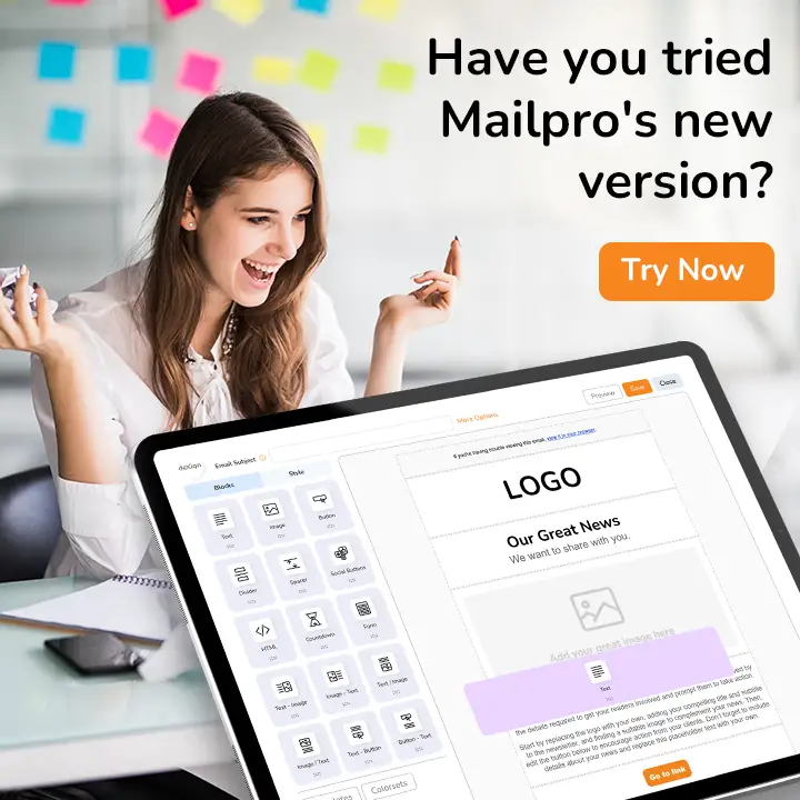
How Mailpro Helps You Design the Perfect Newsletter Header
Designing a professional newsletter header doesn’t have to be complicated or time-consuming — especially when you're using a platform built to simplify the process. Mailpro provides all the tools you need to create clean, branded, and effective headers in just a few clicks.
Here’s how Mailpro makes it easy:
Drag-and-Drop Builder with Custom Header Blocks
No coding? No problem. Mailpro’s intuitive drag-and-drop editor allows you to insert pre-designed header blocks that can include your logo, brand colors, and titles. You simply choose a layout, upload your logo, and adjust fonts, alignment, and spacing to fit your brand’s look and feel.
This is perfect for users who want professional results without needing to touch any HTML.
Responsive Design Tools
All email templates and header elements in Mailpro are built to be mobile responsive. That means your header automatically adjusts to different screen sizes and devices, ensuring a polished look on desktop and mobile alike.
You can preview and test how your header appears across multiple devices — all within the platform — so you can be confident before sending.
Templates Optimized for Branding
Mailpro offers a variety of professionally designed templates, many of which come with customizable headers already built in. These templates follow best practices for header structure, spacing, and alignment, making it easy to stay on-brand with minimal effort.
Whether you’re in e-commerce, SaaS, education, or nonprofit, you’ll find templates tailored to your industry that help you stand out.
If you send frequent campaigns, you can also save your header as a reusable block — maintaining consistency across all emails while saving time.
Final Thoughts and Action Steps
Your newsletter header is more than just the top of your email — it’s your first visual impression, your branding anchor, and your reader’s entry point into your message. A well-crafted header can build trust, improve engagement, and guide your audience through your content with ease.
As you begin designing or refining your headers, remember to:
- Keep the layout clean and consistent
- Stick to your brand guidelines (colors, fonts, logos)
- Optimize for responsiveness and loading speed
- Use tools like Mailpro to simplify the process and maintain design quality
Ready to put it into action?
You can create a free Mailpro account today and start designing professional newsletter headers right away using our intuitive editor and ready-to-use templates.
👉 Start your free account now
Whether you’re sending one email a month or managing multiple campaigns a week, a great header sets the tone for success — and with the right tools, it’s easier than ever to get it right.
